

Pocketpills — Webflow Design & Technical Development Case
Category
Graphic Design, UI/UX, Web-DesignAbout This Project
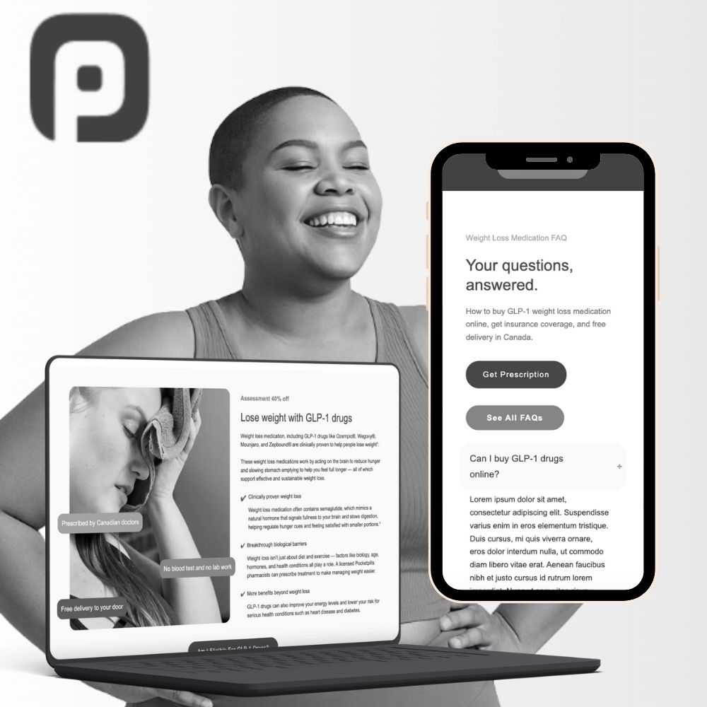
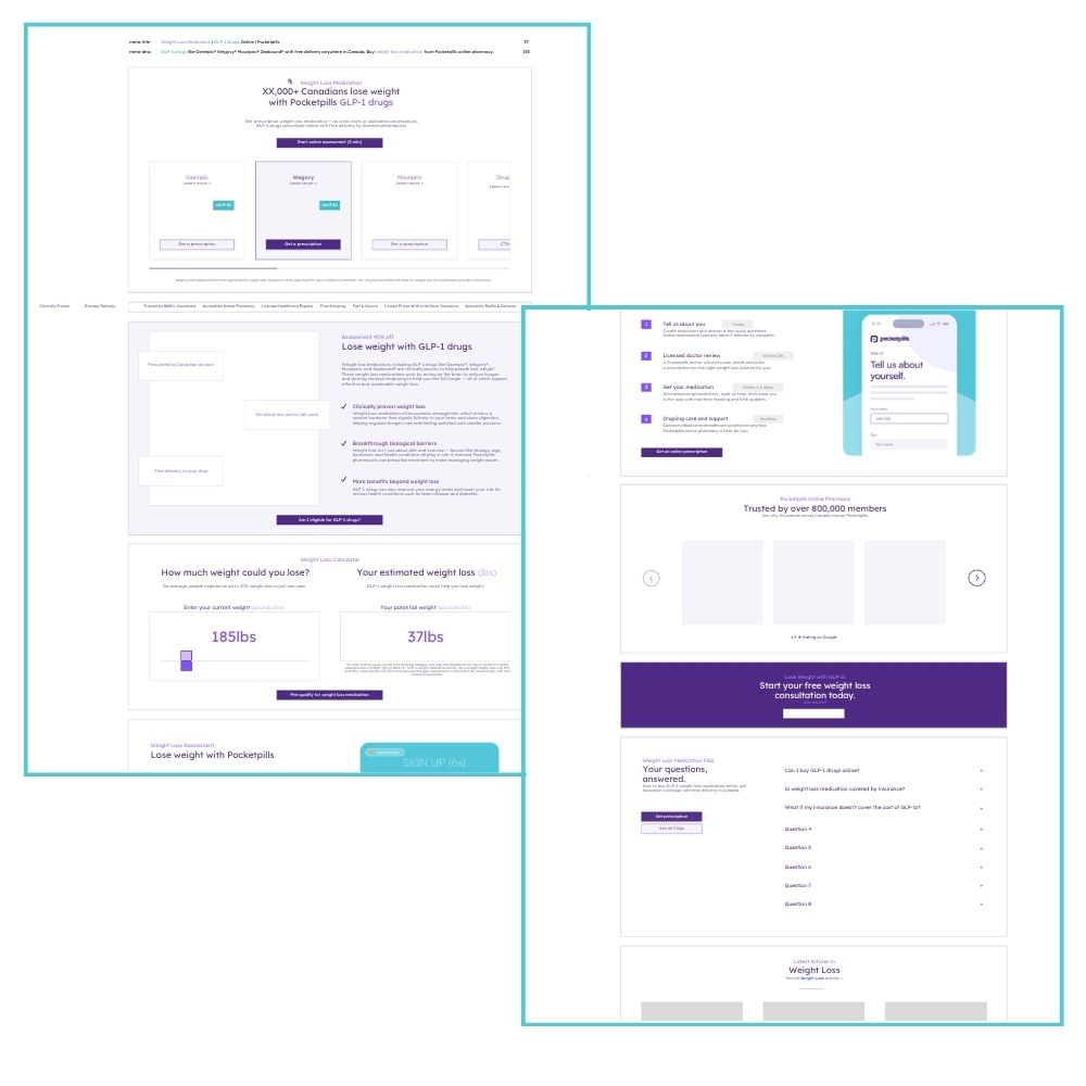
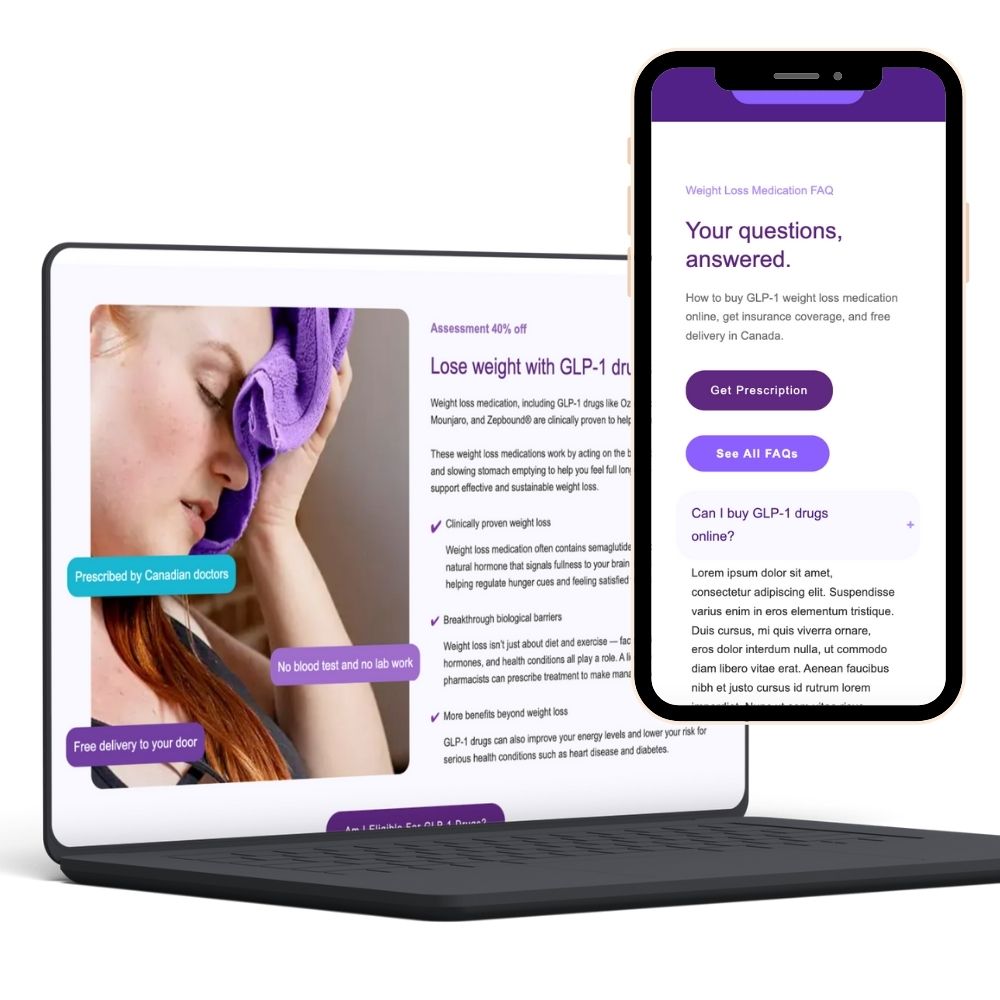
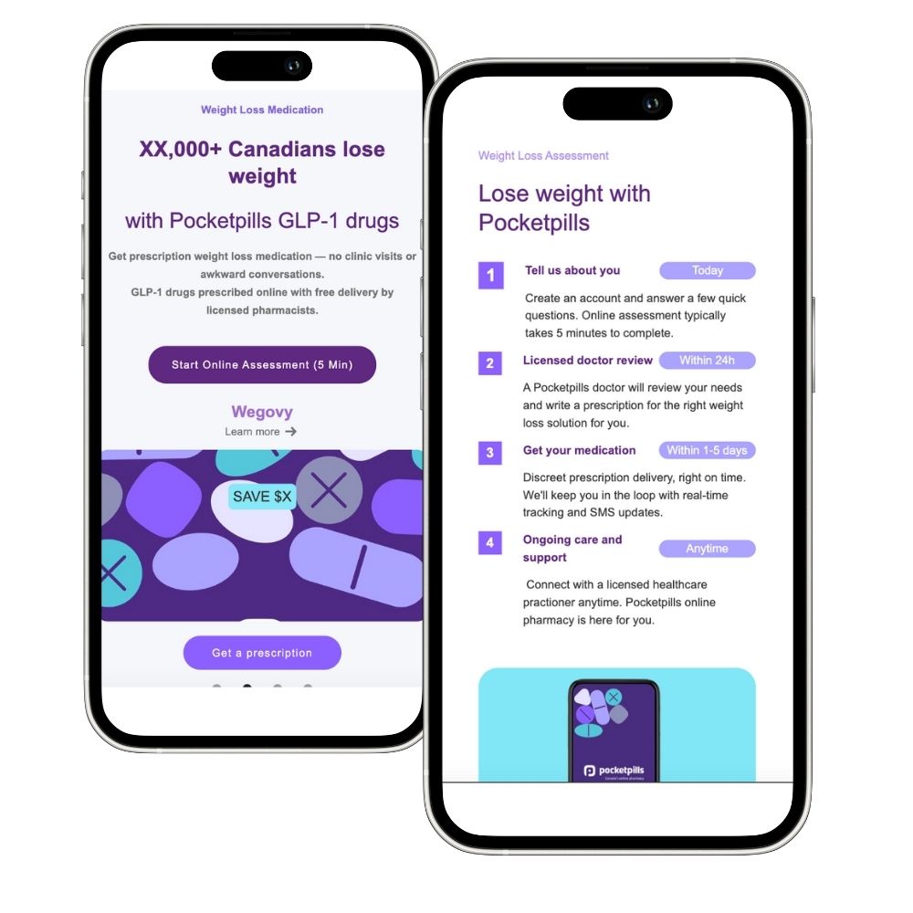
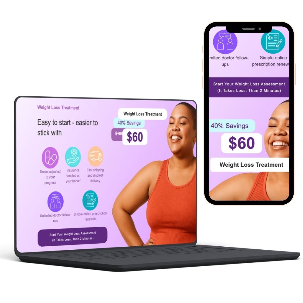
Brief: Create and launch a new Weight Loss Treatment landing page, and redesign an existing homepage banner to improve visual impact and conversion potential — all within the Pocketpills brand system.
Platform: Webflow (no-code build from scratch)
🔗 Live link – New Page
🔗 Live link – Banner Iteration
Approach:
I translated Pocketpills’ clean, accessible brand into a modular Webflow layout designed to feel both trusted and uplifting. Starting from a bare wireframe, I introduced a bolder visual hierarchy, generous white space, and confident use of their signature purple to guide focus and build credibility. Geometric accents and authentic photography emphasize empowerment and ease — aligning with the 90% female audience insight.
Design Highlights:
-
Fully responsive build structured with Webflow’s native CMS and reusable components for easy scaling.
-
Conversion-focused hero with prominent CTA and benefit-led messaging.
-
Interactive sections that feel dynamic without relying on custom code.
-
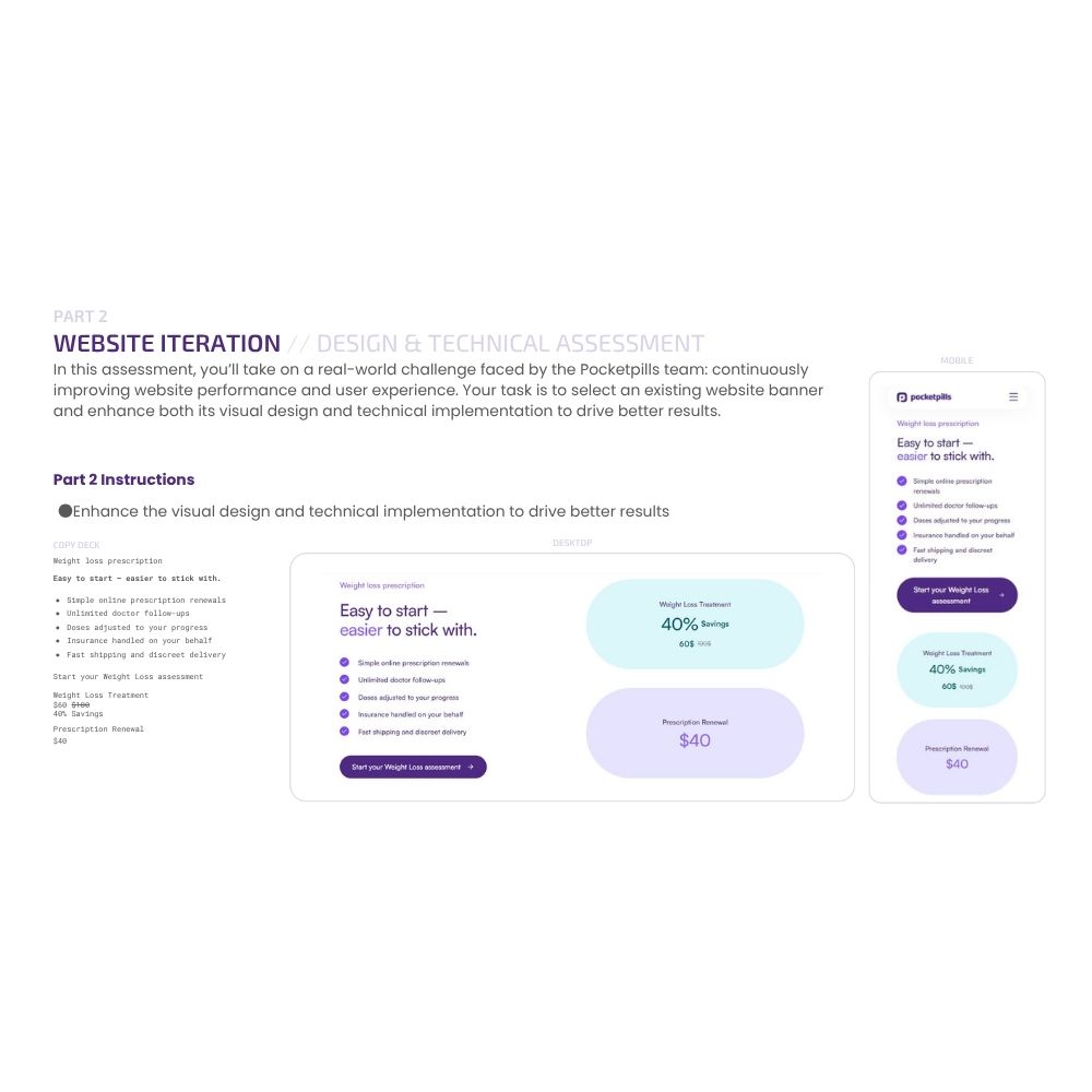
Banner redesign emphasizing clarity, visual rhythm, and brand warmth to support higher engagement.
Result:
A polished, conversion-oriented experience that balances clinical trust with modern energy, showing how thoughtful visual design and clean Webflow structure can elevate brand storytelling and usability simultaneously.